Eventually
Mobile Task Manager
Discipline
Product Design
The Problem
Most task management apps are built for people who are already organized. They reward productivity, stack features, and quietly shame you when tasks pile up. Overdue tasks feel overwhelming, and notification badges accumulate. The interface assumes you'll check in every day and punishes you when you don't. For people with ADHD, autism, or other neurodivergent traits, these tools create anxiety instead of reducing it. The people who need help staying organized the most are the ones these tools fail the hardest.
Research
I interviewed three people who experience these challenges firsthand. My brother, who has severe ADHD, and his wife, who sees the daily impact on their household. A former boss of mine who manages ADHD while running a team. And a friend who is on the autism spectrum. Their experiences revealed a shared frustration: existing tools feel like they're designed to judge you, not help you. What they actually needed was something low-pressure, visually calm, and simple enough to use without thinking about how to use it. I also analyzed Todoist, Notion, and MinimaList to understand where the market falls short for this audience.
Design Approach
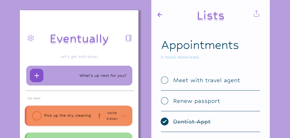
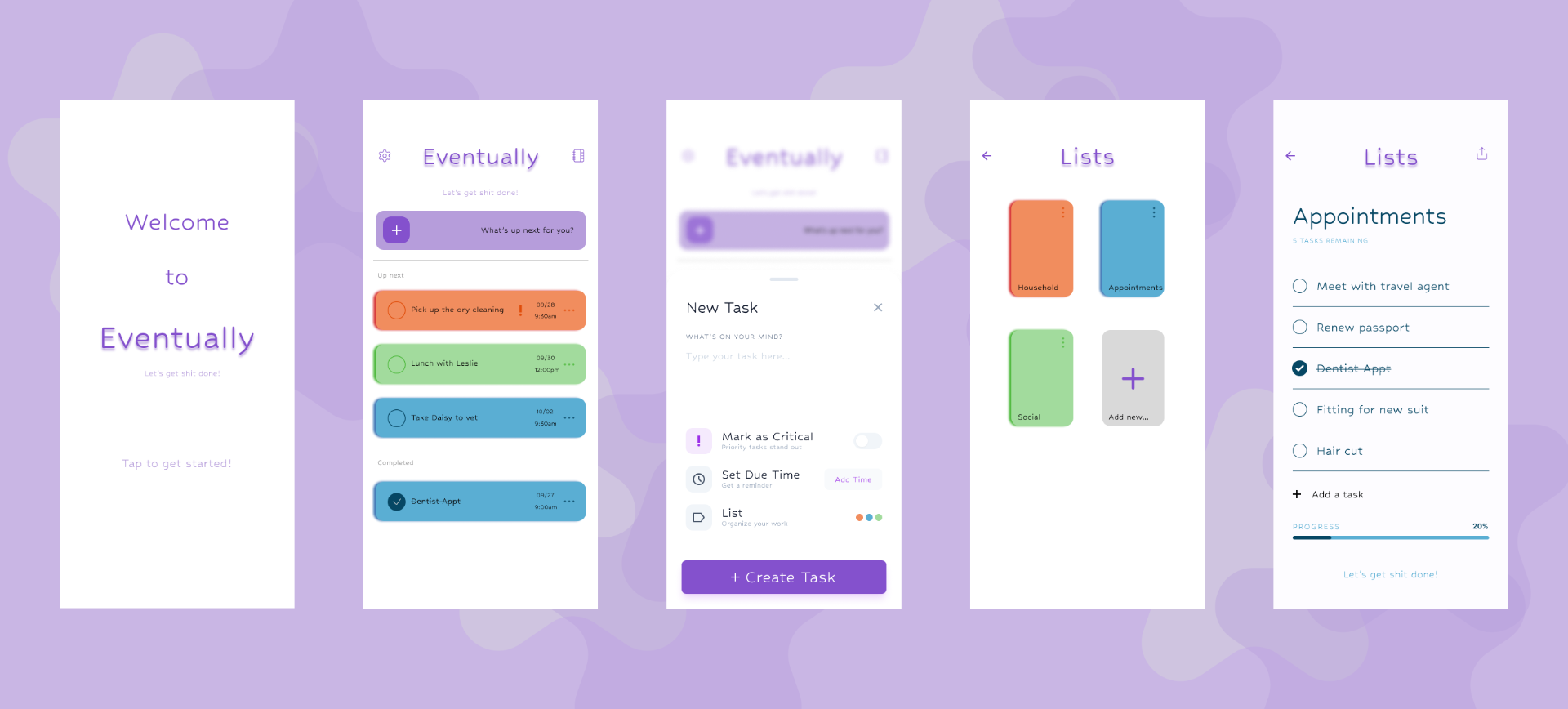
Eventually takes the opposite approach from traditional productivity apps. The motto, "Let's get shit done," sets the tone immediately. This isn't a corporate planner. It's a casual, judgment-free tool that meets you where you are. The visual design uses soft lavender tones and a minimalist layout to reduce visual noise and cognitive load. Nothing competes for your attention. Nothing flashes or reminds you that you're behind. The interface is straightforward on purpose so users can create and manage lists without getting lost in settings, views, or features they'll never use.
Key Decisions
The casual, silly tone was a research-driven choice. Every person I interviewed described feeling shame or stress when they fell behind on tasks. A low-pressure voice that says "let's get shit done" instead of "you have 14 overdue items" changes the emotional relationship between the user and the app.
The minimalist interface was designed to reduce decision fatigue. Neurodivergent users often struggle with executive function, which means too many options can be paralyzing. Eventually keeps the interaction model simple: create a list, add items, check them off. No nested projects, no priority matrices, no integrations to configure.
The color-coded list system serves both organization and accessibility. High-contrast category colors on a soft lavender background help users scan and sort visually rather than relying on text hierarchies. This is especially useful for users who process visual information faster than written labels.
What I Learned
Designing for neurodivergent users taught me that simplicity isn't a limitation, it's a feature. Every element I chose not to include was just as intentional as the ones I kept. The research made it clear that reducing cognitive load matters more than adding functionality, and that the emotional tone of an app is just as much a design decision as the layout or color palette.
What's Next
The current design is platform-flexible, leaning toward Android and Google device conventions but easily adaptable to iOS with minor adjustments. I plan to continue developing Eventually by conducting usability testing with neurodivergent users and exploring new directions based on their feedback. The foundation is solid. The next step is putting it in people's hands and learning what it could become.
Next project — 03
Kindred
Mobile Nonprofit Operations App
Based in
Salt Lake City, Utah
Available for
Actively seeking full-time UX roles and freelance projects.